Redefining Slimming Services with a Tech-Enabled, User-First Platform
Project Overview
Reshape’s previous digital presence lacked the motivation and clarity needed to inspire users to start their lifestyle transformation. The challenge was to design a wellness-focused platform that would simplify the journey—making advanced fitness treatments feel accessible, effective, and easy to book. The solution involved creating an engaging, user-centric experience with a powerful brand video, intuitive treatment discovery, and real results highlighted throughout. From quick bookings to media recognition, every element was built to encourage users to take action and begin their wellness story with confidence.
Reshape needed a website that could truly reflect its goal of making wellness feel achievable and effortless.
The previous site fell short in communicating the brand’s modern, results-driven approach to fitness and slimming. It lacked engaging visuals, a clear treatment discovery flow, and persuasive booking touchpoints—making it hard to inspire confidence or motivate users to take action. The challenge was to craft an experience that felt aspirational yet approachable, while clearly showcasing outcomes, technology, and simplicity at every step.
Objective/Goal
Redesign Reshape’s website to embody its wellness-driven mission through a clean, motivating user experience. The goal was to showcase treatments, real outcomes, and advanced technologies while making it easy for users to explore options and book their transformation journey with confidence.
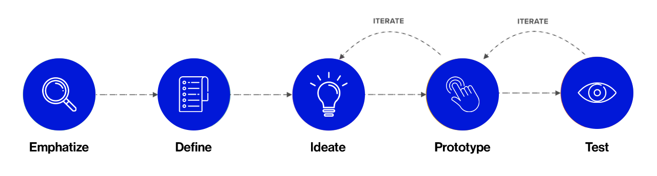
My Design Process
EMPHATIZE
Research
COMPETITIVE MARKET ANALYSIS
To understand how Reshape could stand out, I began by analyzing the wellness and slimming industry landscape. I reviewed several competing fitness and beauty treatment websites, focusing on their booking flows, service presentation, and user engagement. This research revealed a gap in emotionally compelling, result-focused platforms that offer both simplicity and trust—guiding how the new Reshape experience was designed.
Slimmers World
International
STRENGTHS
• Established brand presence with strong industry credibility • Offers both fitness and aesthetic programs under one roof • Clear list of services and program options • Branch locator for nationwide access
WEAKNESSES
• Website design and layout feel outdated • Limited use of engaging media or modern visuals • Booking process lacks immediacy and clarity • Weak emotional storytelling or transformation focus
FEATURES
• Categorized list of slimming and fitness treatments • Basic media section with events and awards • Contact and inquiry form • Program descriptions available per branch
Marie France
STRENGTHS
• Professional, science-backed approach to slimming • Strong use of real testimonials and visual proof of results • Clean interface with a modern feel • Personalized consultation messaging is well-integrated
WEAKNESSES
• Some pages rely heavily on text, reducing engagement • Booking journey is slightly buried and not instantly accessible • Lack of interactive tools or guided service discovery
FEATURES
• Detailed service and treatment breakdown • Real client success stories and video testimonials • Free consultation CTA across multiple sections • Blog and FAQ for educational content
The Aivee Clinic
STRENGTHS
• High-end branding with luxurious, modern aesthetics • Excellent photography and immersive visual design • Wide range of advanced treatments • Strong social proof via media features and celebrity endorsements
WEAKNESSES
• Service pages focus more on image than clarity of treatment flow • Booking and inquiry steps could be more streamlined • Navigation sometimes feels content-heavy without prioritization
FEATURES
• Highlighted signature treatments and technologies • Media and press features integrated throughout • Clinic locations and doctor profiles • Online inquiry and newsletter form
USER INTERVIEWS
To understand user needs, I spoke with individuals exploring wellness treatments.
Many shared concerns about complicated booking processes, unclear service offerings, and doubts about visible results. These insights helped shape a digital experience that prioritizes simplicity, builds trust through real outcomes, and motivates users to take action confidently.
Key Insights
Clarity in Treatment Options
Users wanted straightforward information about what each treatment does and how it works. Breaking down services by category and highlighting one “hero” treatment helped ease decision-making and spark curiosity.
Real Results Drive Motivation
People were most inspired by visible transformations and real outcomes. Featuring testimonials, treatment videos, and before-and-after content proved essential in building trust and encouraging action.
Seamless Booking Experience
A major pain point was complicated or unclear booking flows. Users valued a simple, direct path from discovery to scheduling—making intuitive navigation and clear CTAs critical to conversion.
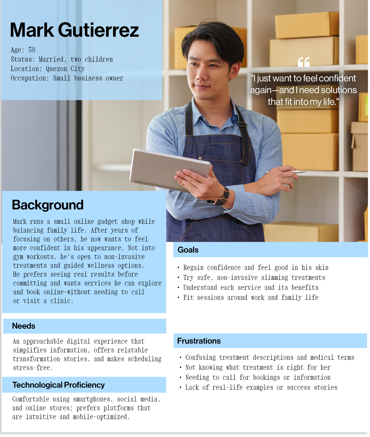
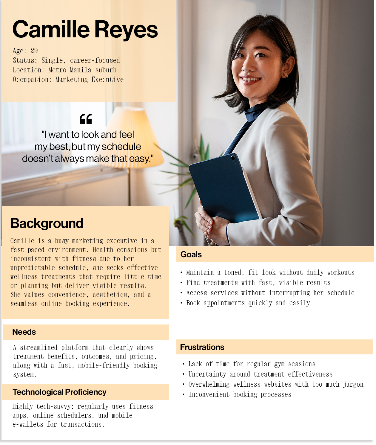
User Personas
Based on findings from user interviews, I developed personas to represent key audiences seeking wellness and slimming treatments. These profiles captured user motivations, hesitations, and expectations—helping shape a digital experience that feels approachable, reassuring, and tailored to individual lifestyle goals.
POV
Points of View
People exploring fitness and slimming treatments—whether busy professionals like Camille or multitasking moms like Maricel—need a clear, encouraging way to understand their options, see real results, and trust the effectiveness of what they’re booking. With different goals and routines, users want simplicity, credibility, and flexibility in pursuing their wellness journey.
HMW
How Might We
How might we design a wellness website that builds trust, showcases visible outcomes, and makes it easy for users—regardless of lifestyle—to discover treatments, feel confident in their choice, and book with ease?
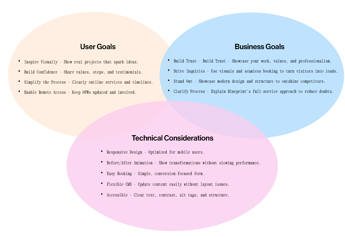
Project Goals
The goal is to craft a modern, motivating website that highlights treatment categories, features real success stories, and simplifies booking. The site should empower users to take the first step in their lifestyle transformation—whether they’re seeking quick results or long-term wellness—by delivering clarity, inspiration, and ease of access.
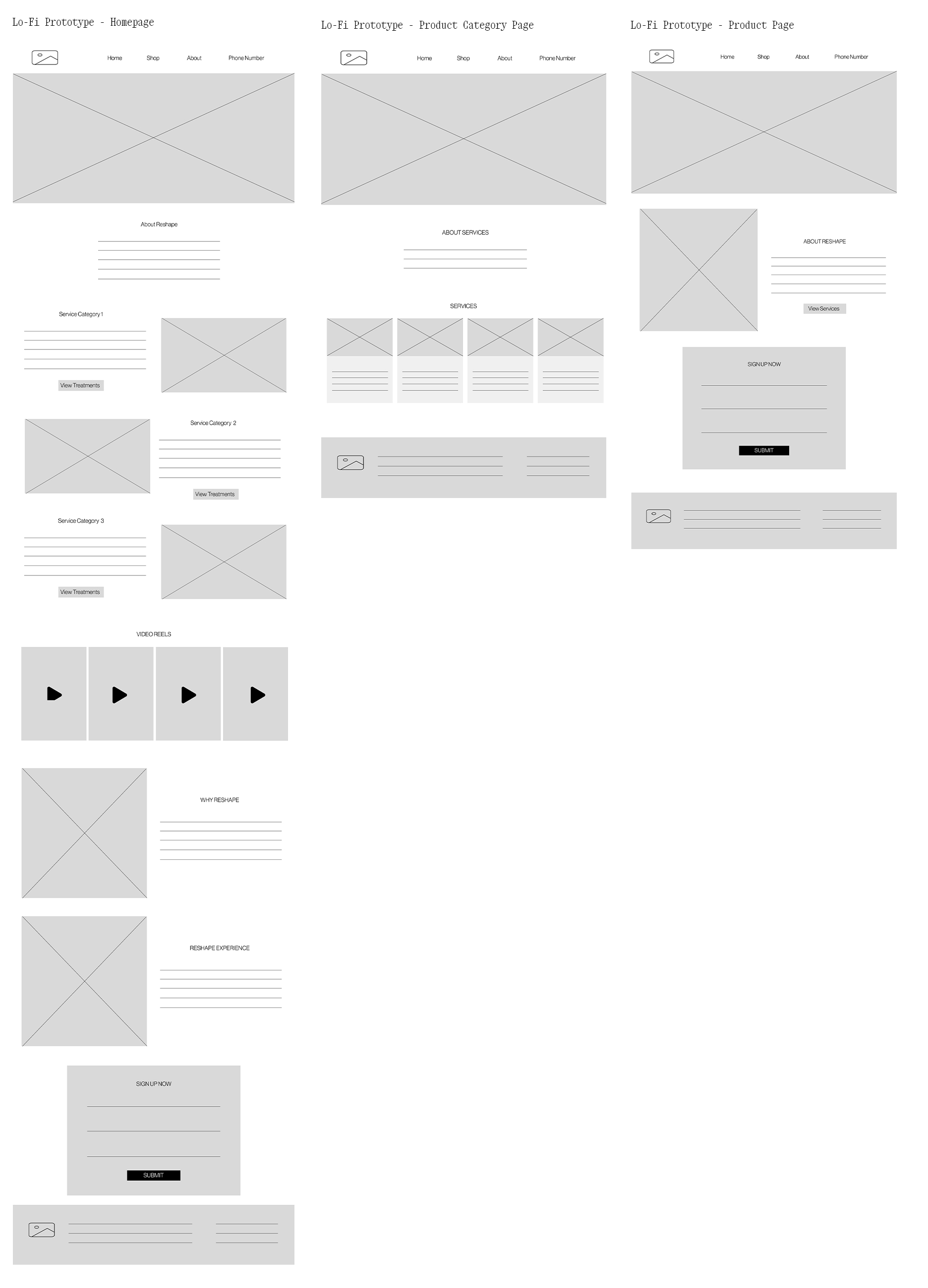
Low - Mid Fidelity Wireframes
I began by creating low to mid-fidelity wireframes to define the content hierarchy, user actions, and visual structure. These early sketches helped establish how Reshape would highlight treatments, guide users toward media features, and promote ease of booking—while keeping the experience clean, welcoming, and forward-focused.
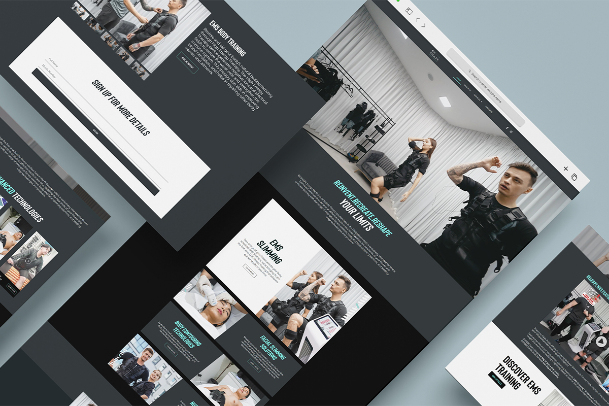
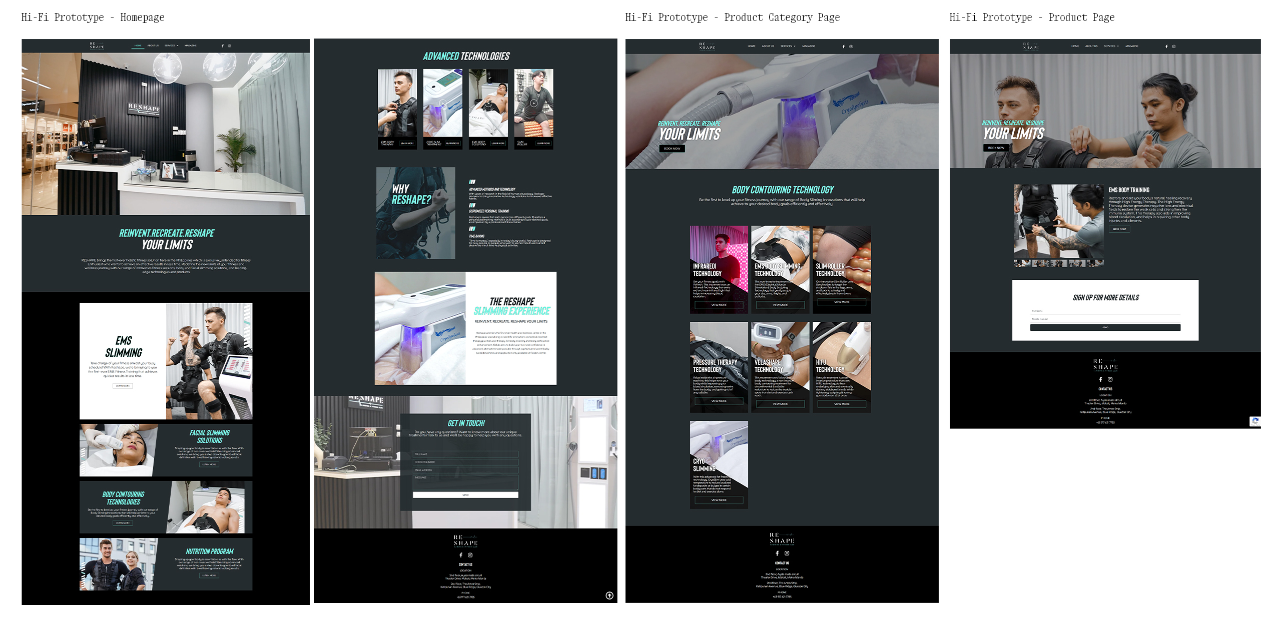
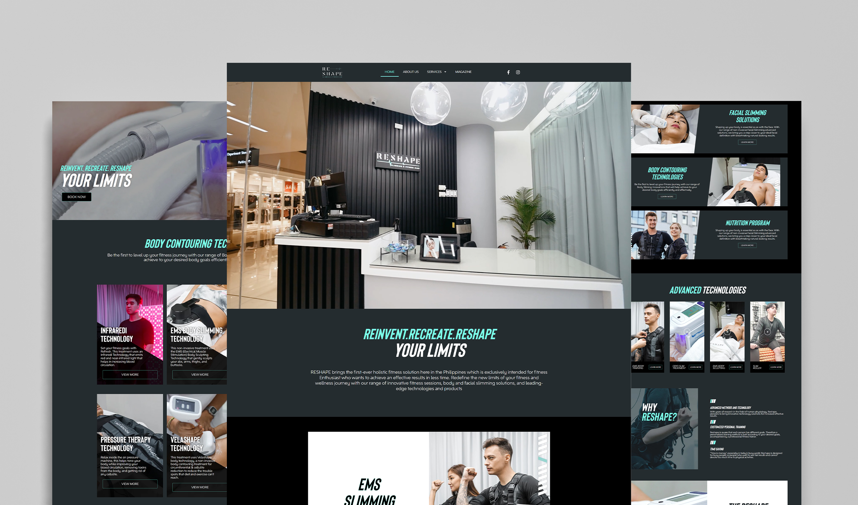
High Fidelity Frames
Once the layout and structure were validated, I translated the wireframes into high-fidelity mockups. These designs reflected Reshape’s modern and approachable brand: soft tones, clean typography, strong imagery, and consistent UI components. The result was a digital presence that felt aspirational yet accessible—encouraging users to start their transformation journey with confidence.
Usability
Testing
To test how well the design served its purpose, I conducted usability tests using interactive prototypes. Key focus areas included treatment discovery, video engagement, and the appointment booking process.
TASK 1
Users quickly understood Reshape’s purpose upon landing on the homepage. The hero video and concise brand messaging made a strong first impression.
TASK 2
Participants interacted with the featured treatment sections and magazine stories, which helped them visualize real results. Video content and transformation imagery were particularly effective in building trust.
TASK 3
Users easily found the booking form and appreciated its simplicity. Clear calls to action and minimal input fields made the process feel efficient and inviting.
User Feedback:
“I wish there were stories or transformations from real people. Something visual that shows the results, not just descriptions.”
“The homepage felt clean, but I was drawn to the videos. They made it feel more real—like something I can picture myself doing.”
“I wanted to see if Reshape is really trusted—maybe something that shows where it’s been featured or what others are saying.”
Iterations
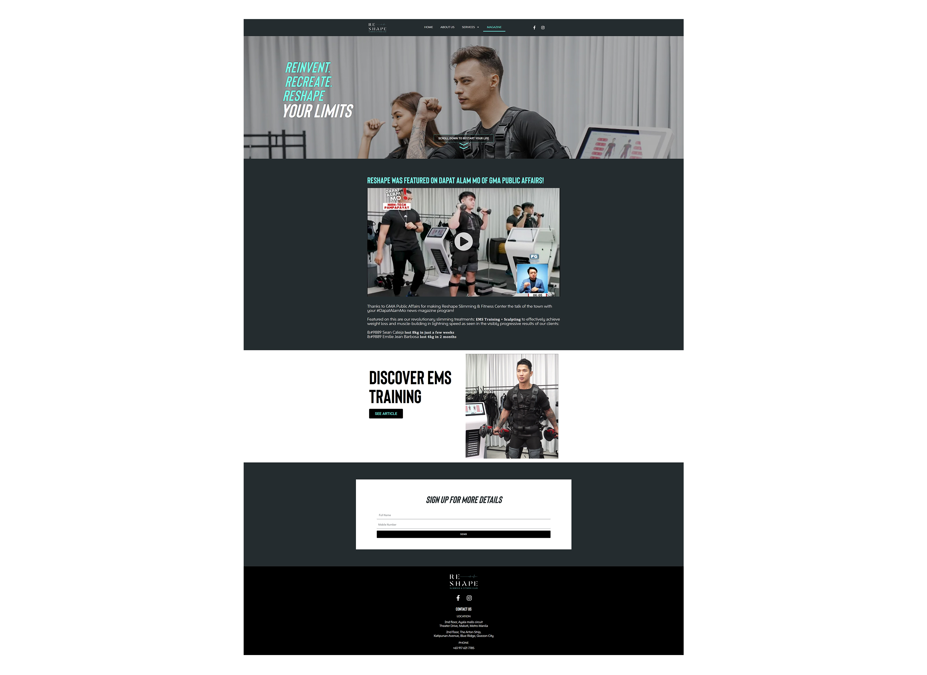
To address this, I introduced a Magazine page to feature media appearances, celebrity endorsements, and client success stories—building credibility through social proof. I also refined the homepage flow to guide users through treatment highlights and trust-building content, reinforcing Reshape’s expertise and reputation in the wellness space.
The new Reshape website offers a sleek, intuitive experience that simplifies wellness through advanced treatments—highlighting real results and making it easy to start the journey.
Key features included:
A brand video in the hero section to instantly communicate vision and energy. Highlighted treatment categories and trending services to guide discovery. A simple, direct booking form to streamline appointments. A Magazine page to showcase media features and build trust through social proof.
Closing
Future Impact
Looking forward, Reshape could introduce a wellness journey tracker that allows users to log treatments and progress over time—paired with AI-powered guidance to recommend next steps or supportive services. This would create a more personalized, data-driven experience that keeps users engaged and motivated.