Revamp with Purpose: Elevating the User Experience Through a Modern, Retail-Inspired Redesign
Project Overview
The client’s website was outdated and no longer reflected the quality of their insole products. They needed a modern, tech-inspired redesign that felt user-friendly, trustworthy, and easy to navigate—almost like an e-commerce experience, but without going fully transactional. The goal was to help users quickly understand the product benefits, build trust, and create a smooth, engaging journey that supports both the brand and its customers.
The outdated website no longer matched the quality of the insoles.
While the products provided real value, the site lacked modern design, intuitive navigation, and user-centered structure. It didn’t build trust, guide users smoothly, or make exploring the products feel effortless. The challenge was to transform the site into a clean, tech-inspired experience—one that felt like an e-commerce platform, without being one—so users could easily understand, engage, and connect with the brand.
Objective/Goal
Redesign and modernize the client's website to reflect the quality of their insole products. The goal was to create a user-friendly, trustworthy experience with a sleek, tech-inspired look—making it easy for users to explore products, understand their benefits, and feel confident in their value.
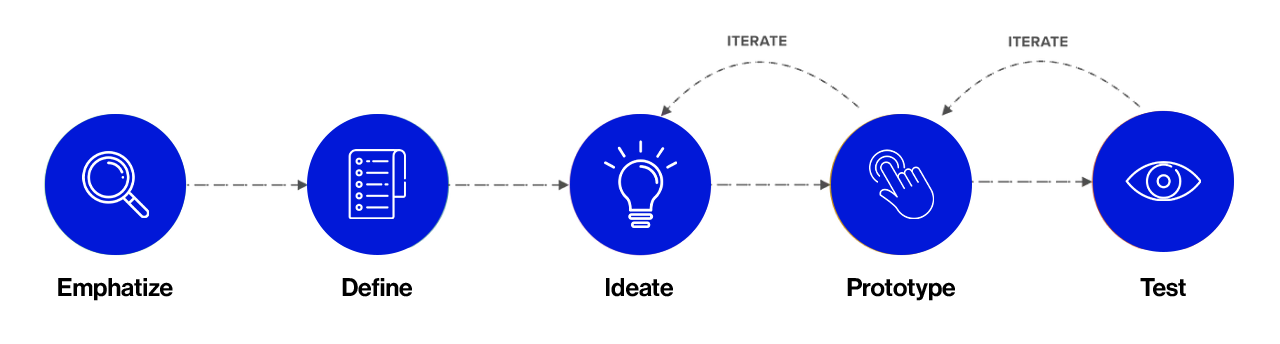
My Design Process
EMPHATIZE
Research
COMPETITIVE MARKET ANALYSIS
We analyzed competitor websites to identify design gaps and user experience patterns. Many lacked modern visuals and intuitive flows. This guided Fixifoot’s redesign toward a cleaner, more user-friendly interface that builds trust and feels like a simplified e-commerce experience.
Vionic
Philippines
STRENGTHS
• High-end product presentation • Strong branding and trust indicators • Built-in orthotic support in all footwear • Mobile-friendly layout • Stylish, professional UI • Easy-to-browse categories
WEAKNESSES
• Higher price point • Limited to pre-designed footwear with • support • No local customization • Focus is on footwear, not insoles alone
• Well-researched orthotic technology • Detailed educational content • Clean and clinical design • Offers both footwear and insoles • Strong trust elements (certifications, tech info) • Visual product mapping
WEAKNESSES
• More clinical than personal • Complex product choices may overwhelm users • Less intuitive on mobile • Prices not locally competitive
FEATURES
• Foot health blog • Orthotic system explanation • Filtered navigation • Shopping cart and e-commerce flow • Insole and footwear categories • Testimonials
• Not visually modern or engaging • Limited online user interaction • Not fully transactional (online orders not prioritized) • Minimal educational content on-site
FEATURES
• <span data-metadata=""><span data-buffer="">Booking for in-person fitting • Insole customization • Brief product info • Contact options • Responsive layout • Basic service overview
USER INTERVIEWS
To Gain a better understanding of user needs, I conducted user interviews
Most users felt overwhelmed by too many options and were unsure about product effectiveness. They wanted clear benefits, a simple interface, and visual proof that the insoles work. These insights shaped a design focused on trust, clarity, and ease of use.
Key Insights
Product Clarity
Most users struggled to understand which insole suited their needs. They preferred clear descriptions, visuals, and simplified product guidance to avoid confusion.
Trust and Credibility
Users were hesitant to purchase due to a lack of social proof. Testimonials, real results, and expert-backed details were identified as key to building trust.
Ease of Purchase
Many found traditional health product sites cluttered or outdated. A smooth, modern experience—similar to e-commerce—was preferred to support faster decisions.
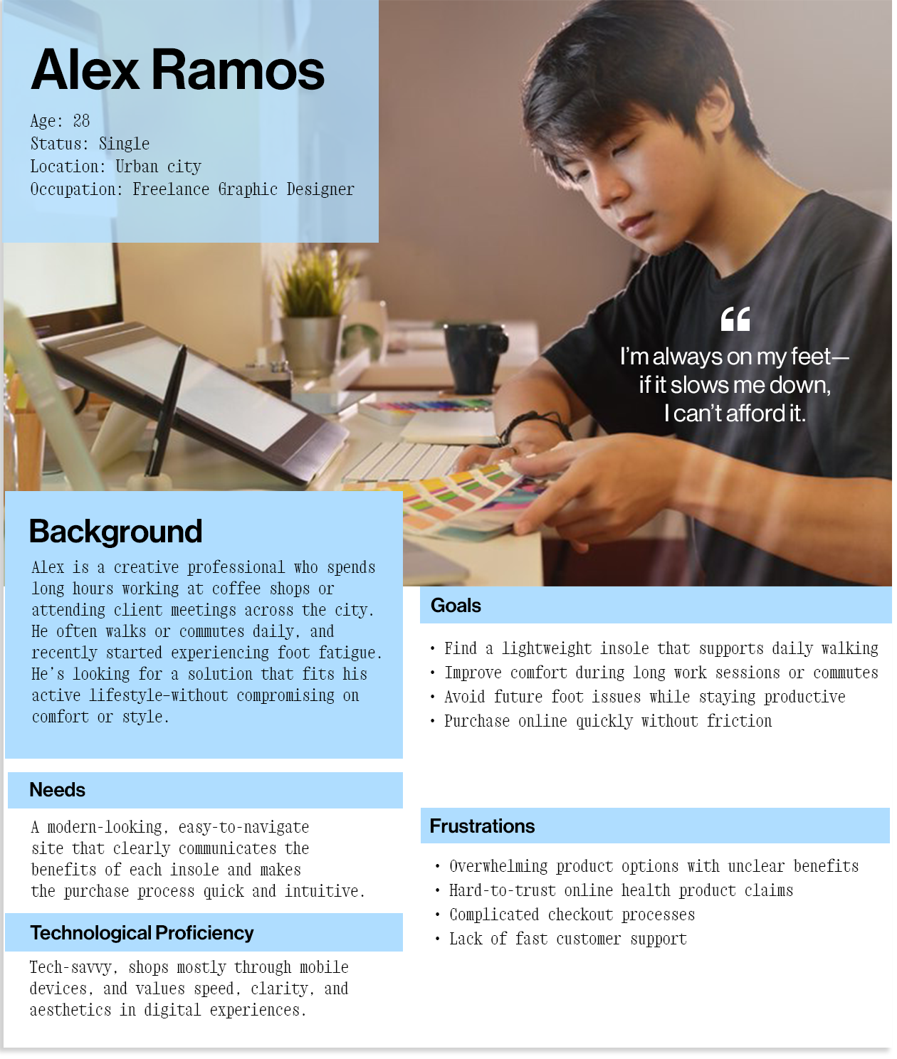
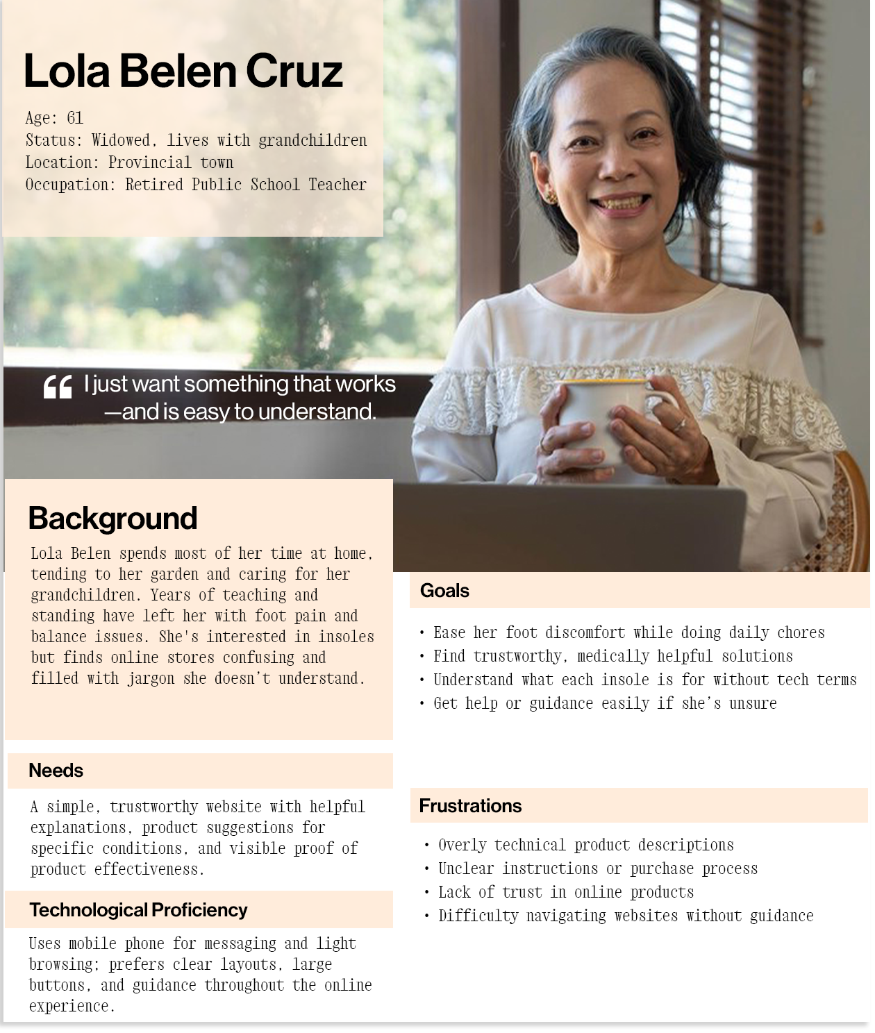
User Personas
Based on the insights gathered from user interviews, personas were developed to better understand the needs, habits, and preferences of people most likely to benefit from Fixifoot’s insole products. These personas helped guide design decisions toward clarity, trust, and comfort-focused solutions.
POV
Points of View
People experiencing foot pain or fatigue need a way to easily find the right insole product online without confusion or doubt. With so many options available and varying needs, users seek clarity, trust, and a simplified path to purchase that aligns with their comfort and lifestyle goals.
HMW
How Might We
How might we design an insole e-commerce experience that clearly communicates product benefits, builds user trust, and makes it easy for customers to find and purchase the right solution for their needs—without overwhelming them?
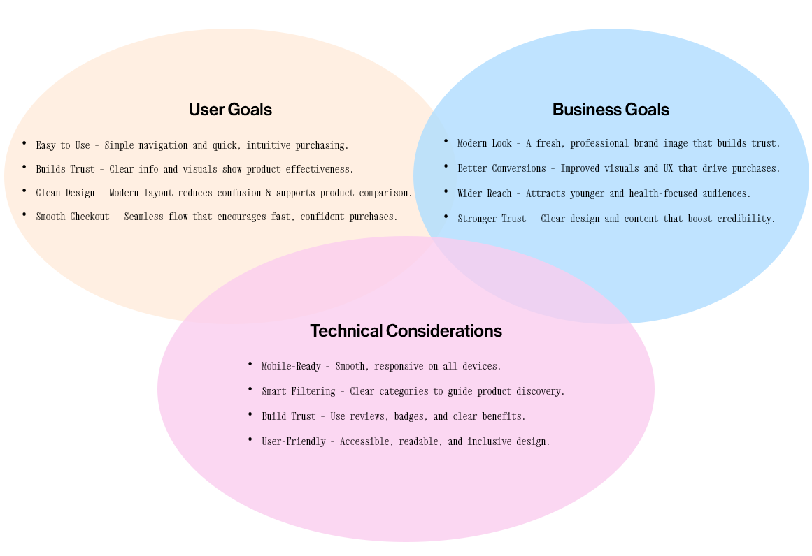
Project Goals
The goal is to create a modern, user-friendly website that simplifies product discovery, builds credibility through visual and social proof, and delivers a seamless shopping experience—especially for users with foot discomfort seeking quick and confident solutions.
User Flow
I created a user flow to map out how customers would interact with the redesigned Fixifoot website — from discovering a product to completing a purchase. This process helped ensure that each step in the journey was intuitive, user-friendly, and aligned with their expectations. It also guided the structure of my wireframes to include all essential screens and interactions needed for a smooth shopping experience.
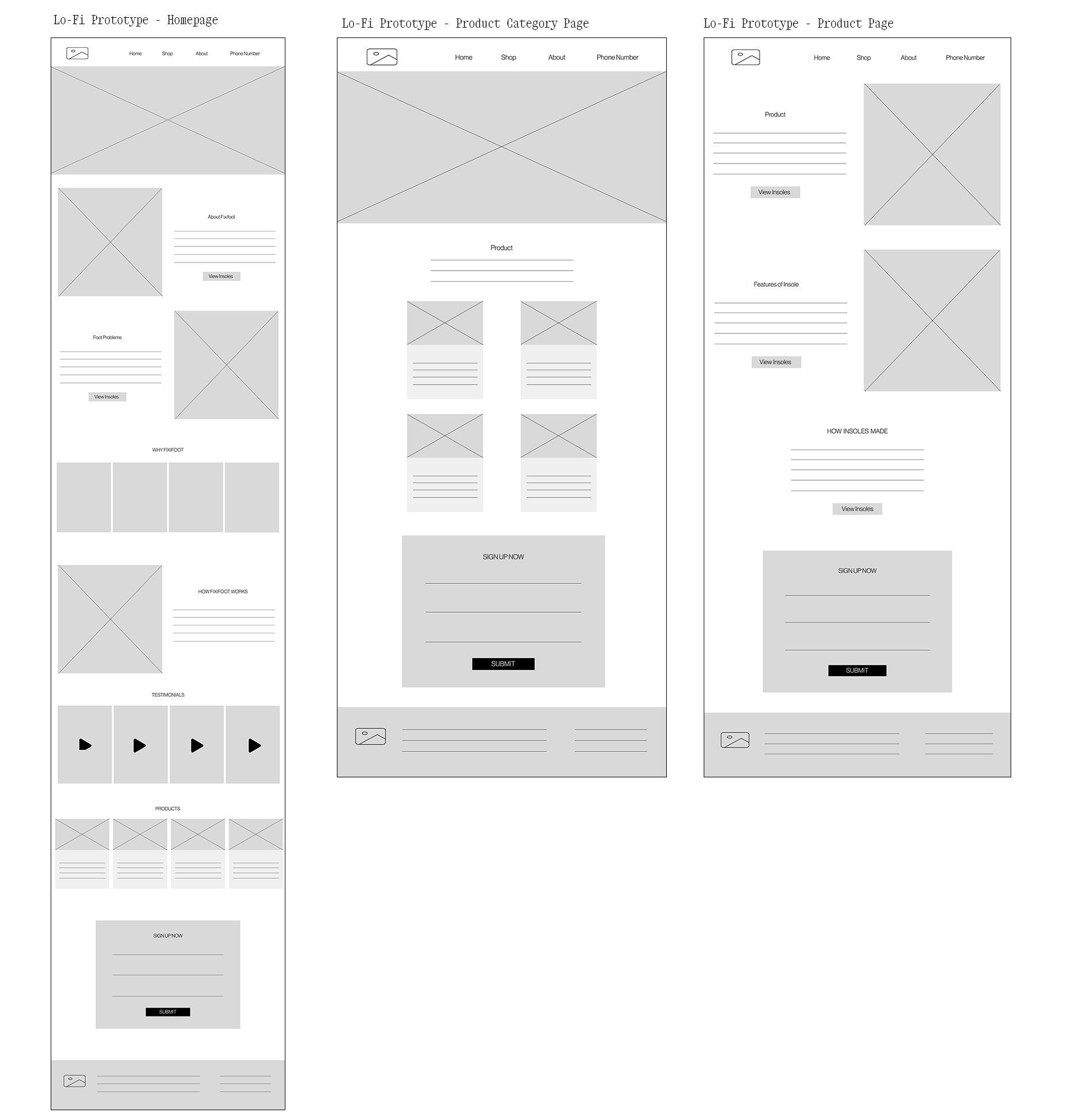
Low - Mid Fidelity Wireframes
I created annotated low to mid fidelity wireframes to visualize how the redesign improves Fixifoot’s layout, usability, and overall structure.
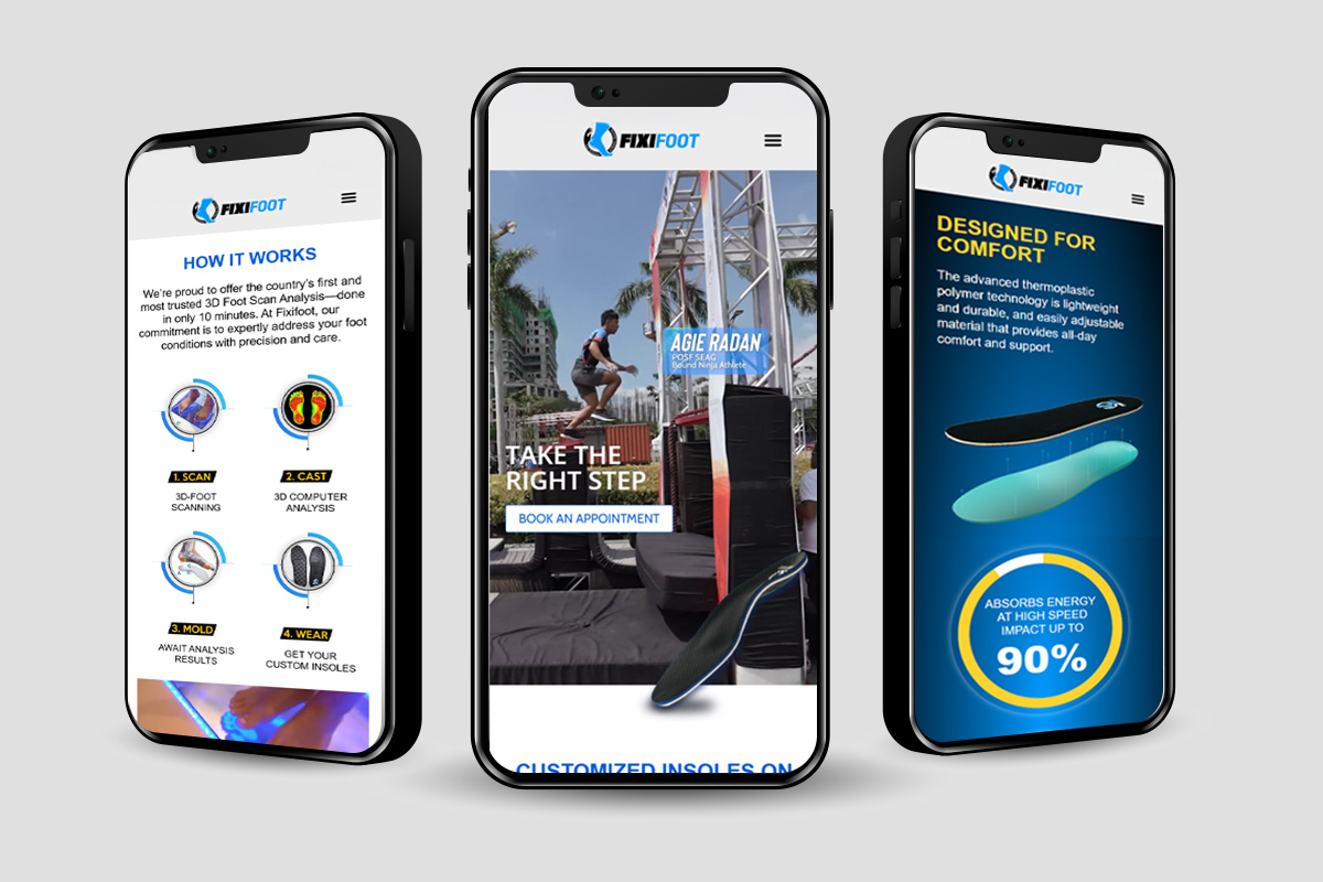
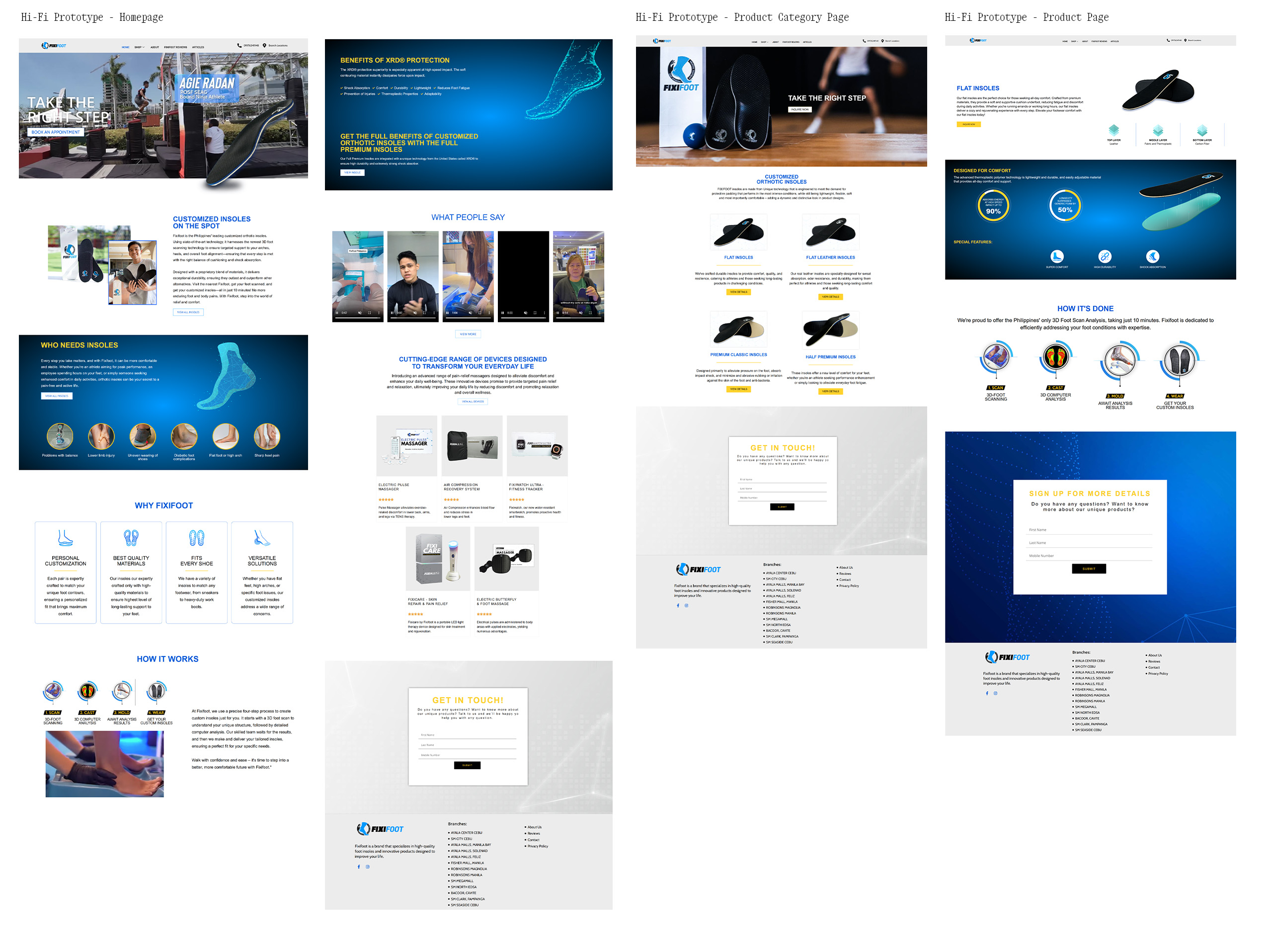
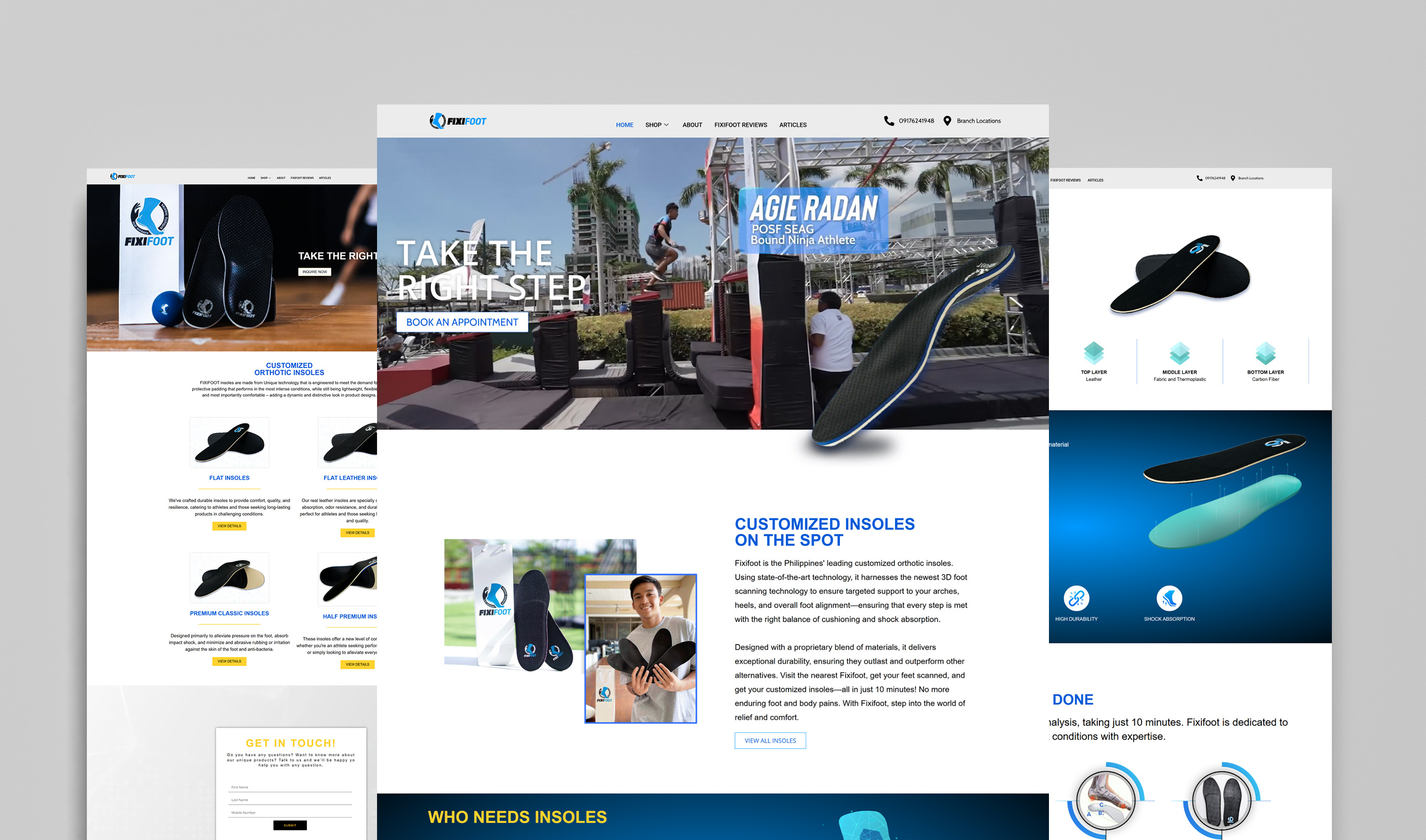
High Fidelity Frames
After finalizing the feature’s flow and placement, I moved on to designing high-fidelity frames. It was essential that the redesign felt consistent within Fixifoot’s existing visual system, so I applied the same colors, typography, and graphic style.
TASK 1
All users were able to open the prototype and navigate the homepage without difficulty. The layout felt intuitive and familiar.
TASK 2
Users were able to identify which insole suited their needs based on their current foot concerns. The product information and visual cues guided their decision effectively.
TASK 3
Participants easily located the sitemap and could access all key pages, confirming that the site structure and navigation were clear and accessible.
User Feedback:
“I really liked how straightforward it was. I found the right insole for my foot pain in just a few clicks.”
“It would be great to see testimonials or stories from people who’ve tried the insoles — it would help me trust the product more.”
“I wish there was a quick way to see all Fixifoot’s branches right on the homepage. That would make it easier to know where to visit or get support.”
Iterations
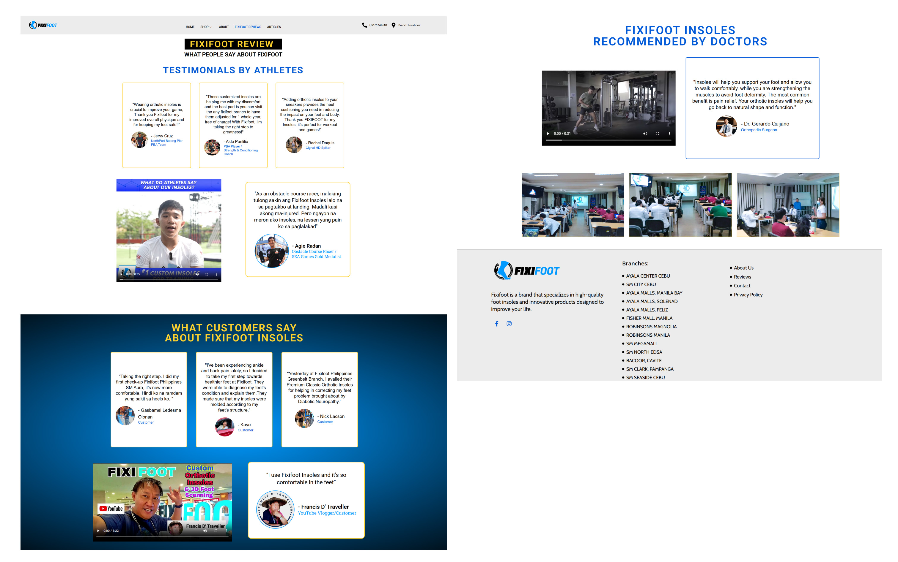
Firstly, I created a dedicated page for Fixifoot customer reviews to showcase authentic feedback from real clients. This helps build trust and lets users see how the insoles have helped others with similar foot concerns.
Iterations
Secondly, I added a comprehensive list of Fixifoot branch locations both on a separate page and in the footer across all pages. This makes it easier for users to quickly find store locations and support options without extra navigation.
The final design improved user confidence and accessibility while maintaining a clean and straightforward interface aligned with Fixifoot’s branding.
Key features included:
Customer Reviews Page: Showcases real user testimonials to increase trust and credibility.
Branch Locator: Available in both the footer and a dedicated page for quick access to store locations.
Closing
Future Impact
For future iterations, I recommend adding a customer Q&A or community section where users can share their experiences and get advice on choosing the right insoles. This would deepen engagement and support.
Secondly, exploring the integration of an interactive insole recommendation quiz could personalize the shopping experience and help users find solutions faster.
Lastly, to increase awareness of Fixifoot’s physical stores, adding a prominent branch locator widget on the homepage with live updates on store hours and events would improve user convenience and encourage visits.